


TECHNICAL SUPPORT


Published 2026-01-19
Have you ever had that moment? The plan is almost finished, and I want to add a small servo motor icon in the corner of the interface. I searched all the resource sites, and found that either the style is too old, or the pixels are blurry as if there is a layer of fog. Download it and put it into a PPT or product manual. It feels awkward no matter how you look at it - it fails to convey the precise and powerful mechanical feeling.
This is not your problem alone. Many people who deal with machinery and automatic control will pause at this seemingly small link. An icon, it's more than just decoration. It is a visual language and a window that conveys the soul of the product immediately. If it's not clear and professional enough, the first impression of the entire project will be compromised.
So the question is: Where can we find a PNG icon that is both professional and beautiful, and can accurately represent the integration concept of "microservices" and "machine control"?
The key is to understand the double meaning behind the icon. Microservice architecture means modularity, agility and independent operation; mechanical and servo control represent precision, reliability and interaction with the physical world. An ideal icon needs to weave these two qualities together.
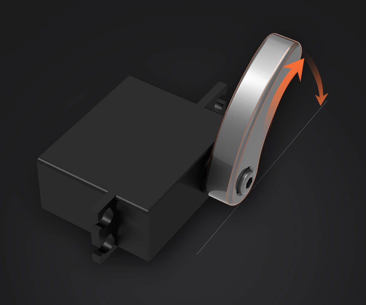
It's not as simple as drawing a gear or a circuit. A good design may use a delicate cluster of small components that interlock with each other but remain independent to symbolize microservices; use a smooth and firm arc or arrow to imply the movement trajectory and feedback loop of the servo motor. Colors should not be flashy, and calm blue, gray or technological gradient colors are often used to highlight clarity and modernity.
The format, of course, is PNG—that format with a transparent background that can be embedded into any document, web page, or presentation, and blended into your design system without any trace. High resolution Yes, it is sharp and clear whether it is placed on the homepage of a web page or printed on the title page of a manual.
Find the right icon and the effect is immediate.
It improves communication efficiency. When you present your solution to your team or clients, a professional visual symbol can instantly anchor their understanding without the need for unnecessary explanation. It makes complex system architecture diagrams user-friendly and technical documentation less daunting.
It reinforces the professional image of the brand. Every visual element you use speaks silently about the standards of your work. A carefully selected and well-designed icon implies your dedication to the details of the project and your overall control of quality.
It saves time and avoids the subsequent troubles caused by "making do". You don’t have to struggle repeatedly among several unsatisfactory options, and you don’t have to worry that the icon you found temporarily will need to be replaced someday in the future.
How to find it specifically? You might as well try this path: Break down your needs into several core keywords: "microservices", "servo", "modularity", "control", and "precision". Explore with different combinations of these words. Don’t just stare at the first search result, flip through a few more pages, sometimes the treasure is hidden behind.
When you see a candidate icon, ask yourself a few questions: Is it too cartoony and loses its mechanical rigor? Are its lines simple and powerful enough? If you reduce it to a practical size, will the details be blurred? More importantly, is it versatile and scalable enough to adapt to various future application scenarios of your project?
The process is a bit like picking out a part for a precision instrument - not just whether it fits right now, but also its "compatibility" and "durability."
We understand this desire for precise visual expression. that's exactly whykpowerContinue to invest energy to polish every detail presented to the outside world. We offer not just a product, but a complete set of supporting elements that can be seamlessly integrated into your workflow. For example, when you need to explain a control system based on a microservice architecture, being able to find a matching and intuitive visual language should be a smooth experience in itself.
"How do you ensure that an icon can meet such professional needs?" This may be a natural question. The answer lies in continuous observation and precipitation. Observe how the industry evolves, observe how technology and design intersect, and then crystallize these understandings into concise visual form. It is not to show off skills, but to allow you to be understood as quickly and accurately as possible when needed.
Ultimately, all efforts are directed toward the same goal: eliminating any unnecessary friction between you and your idea. Make your design drawings full and powerful, and make your plan statement complete in one go. When every detail, down to an icon, is carefully considered, the entire project takes on a trustworthy glow. This may be another manifestation of professionalism - persisting in doing better where others may ignore it.
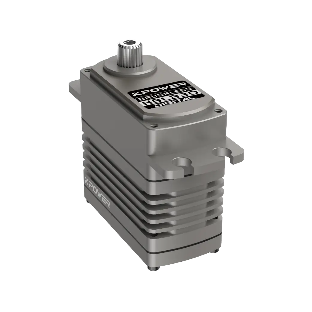
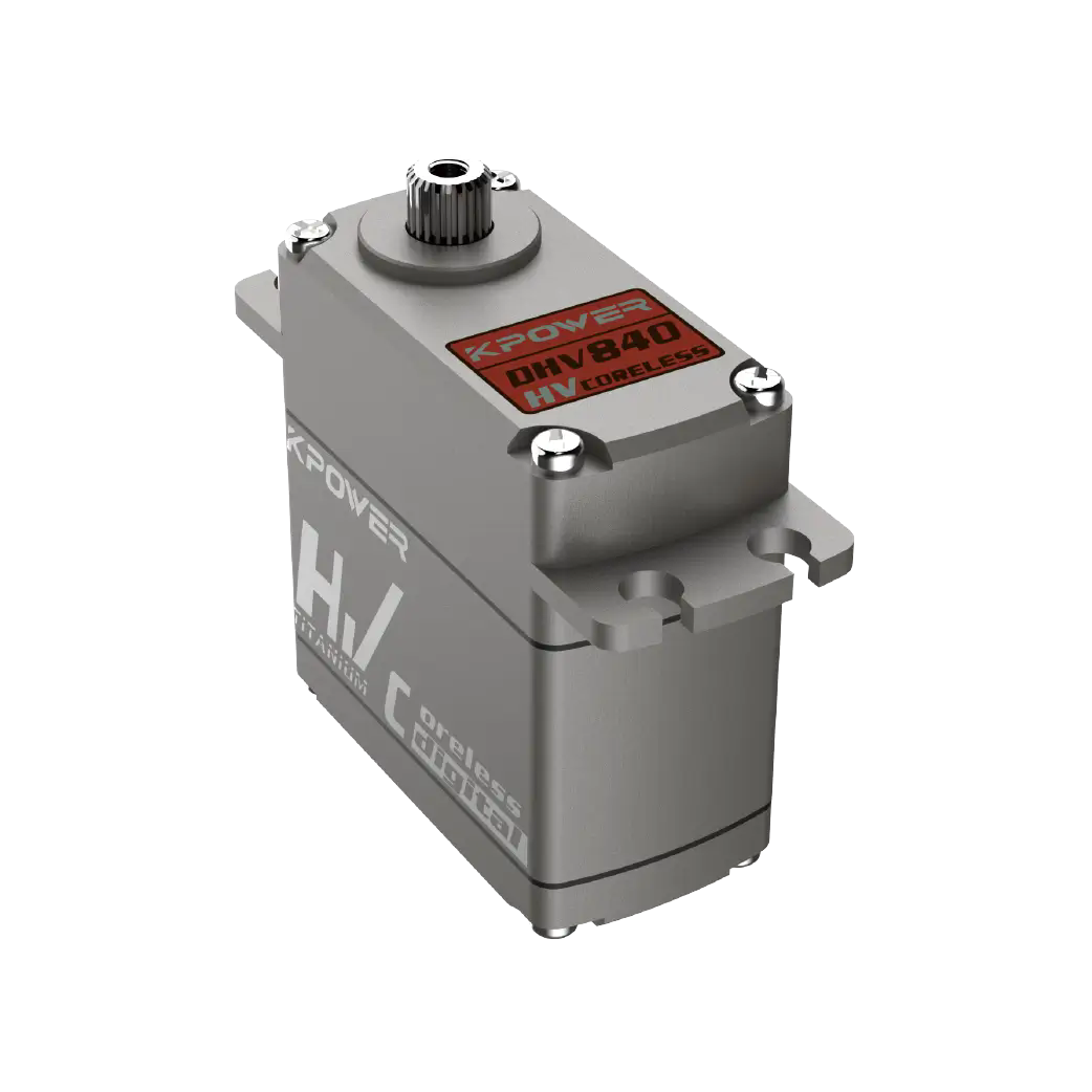
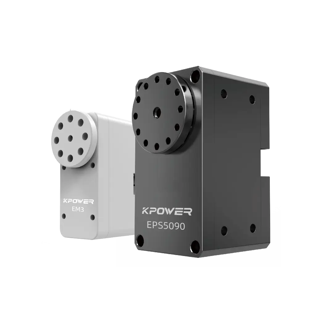
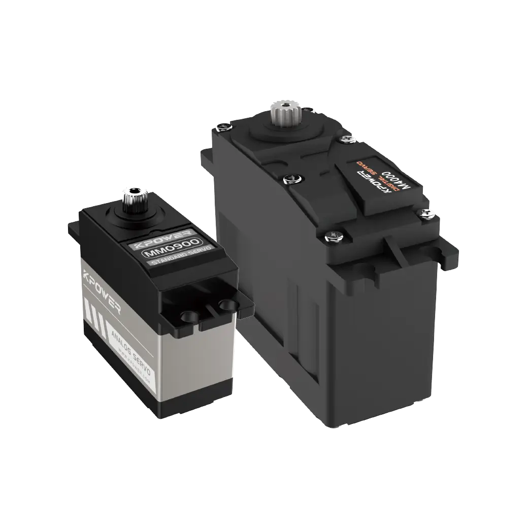
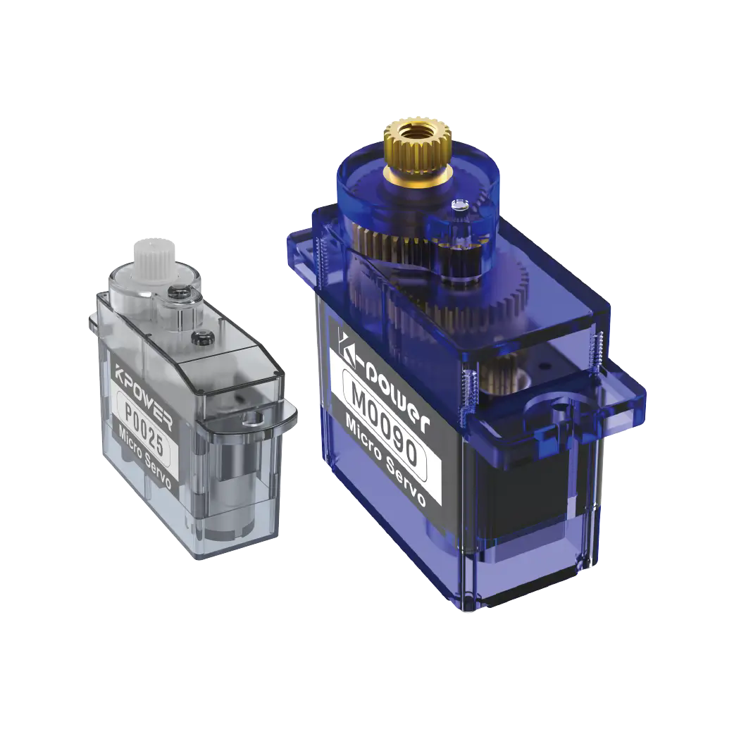
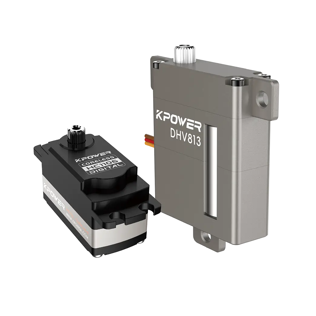
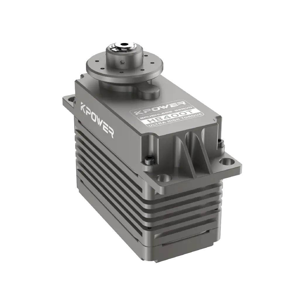
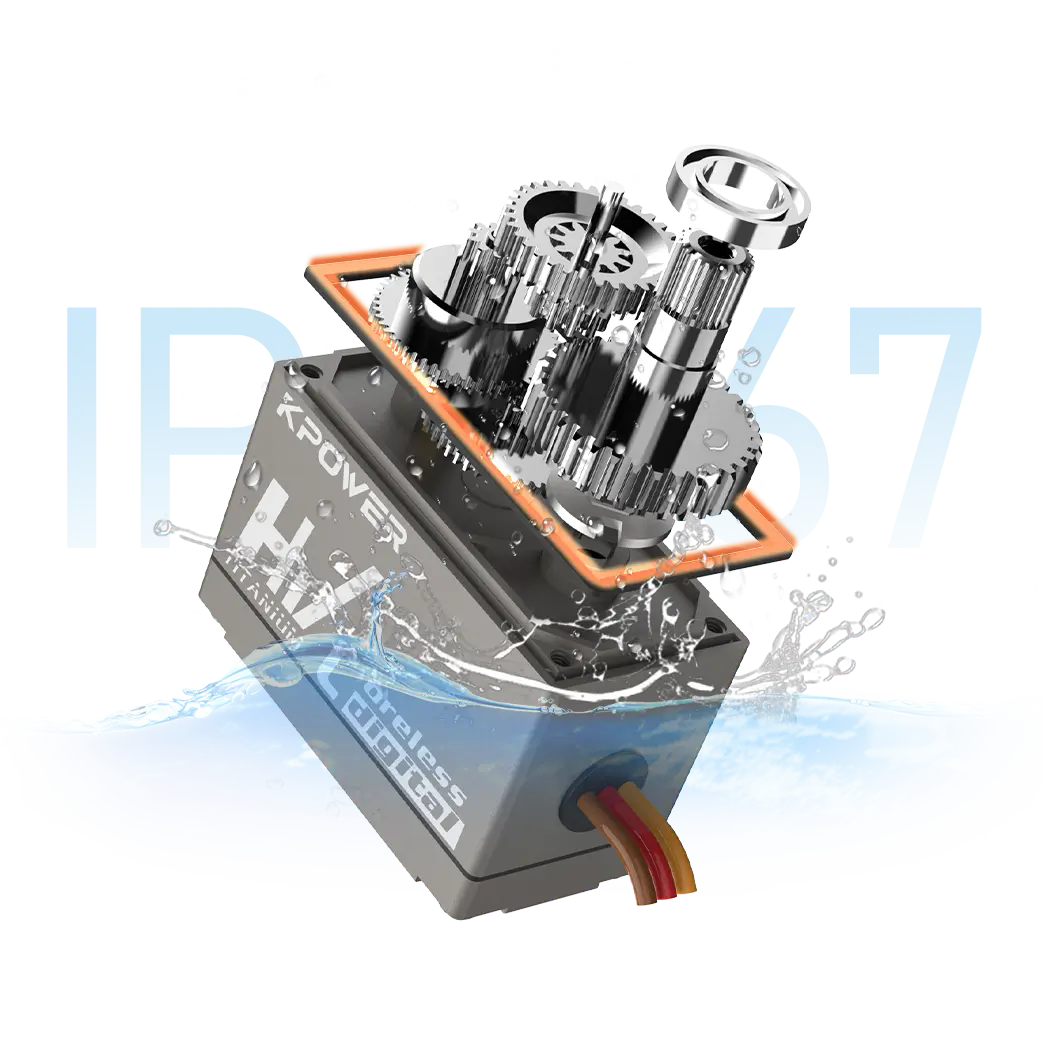
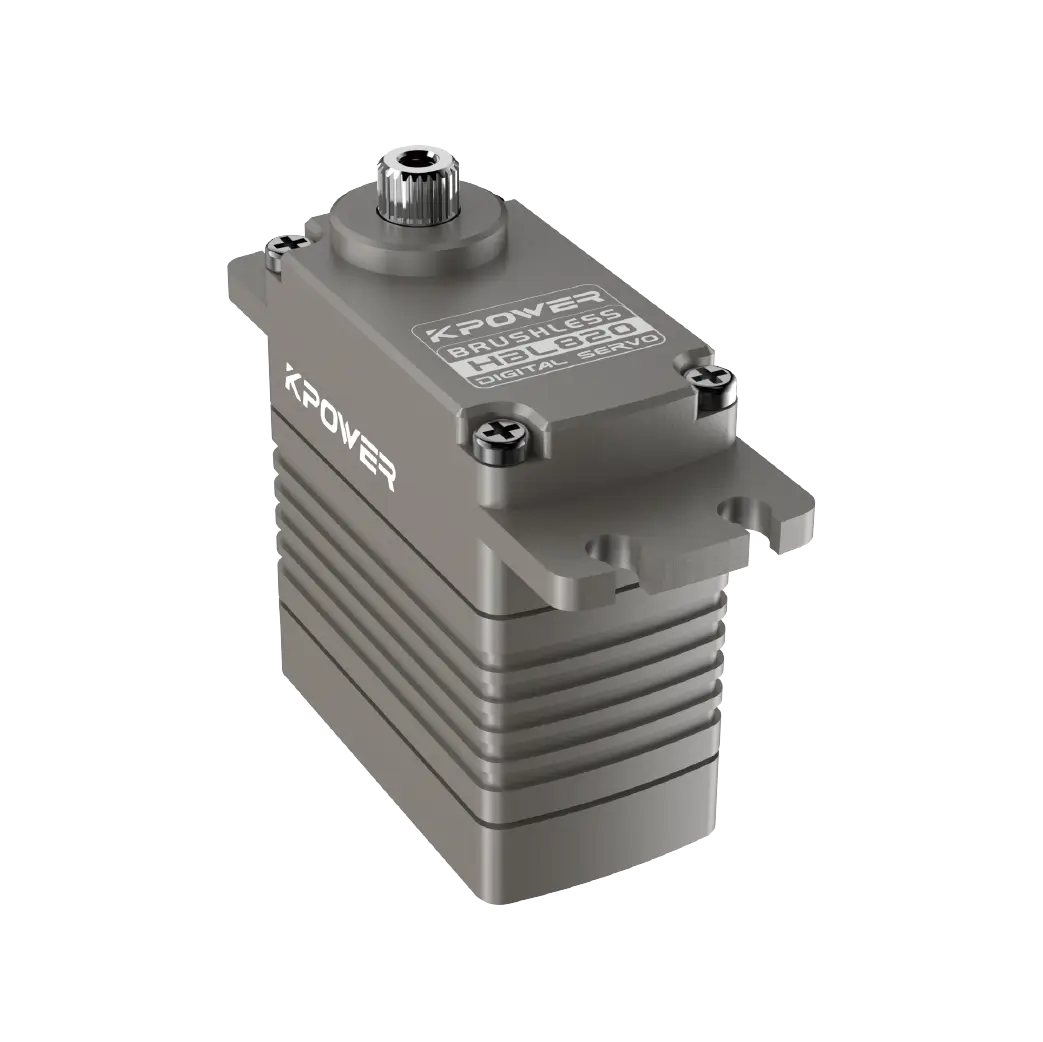
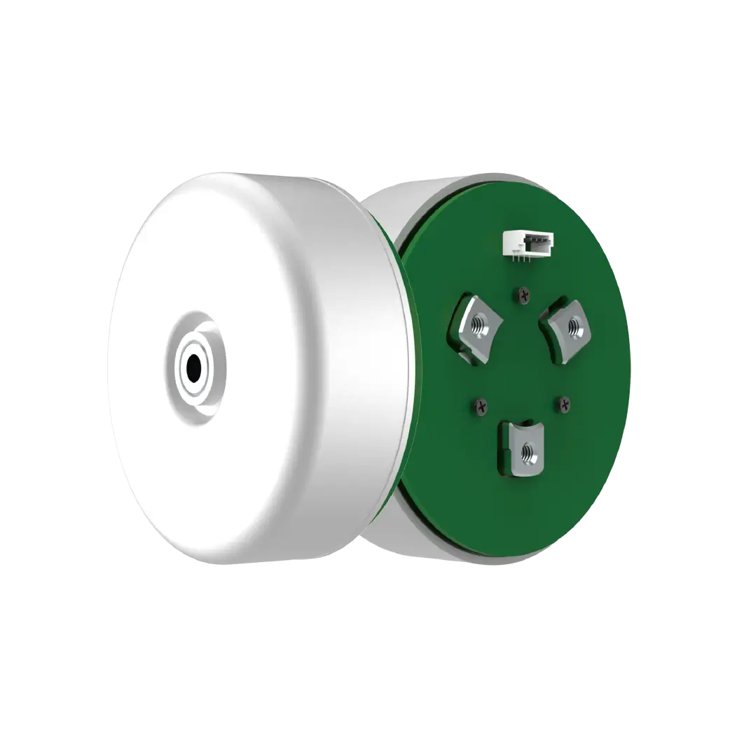
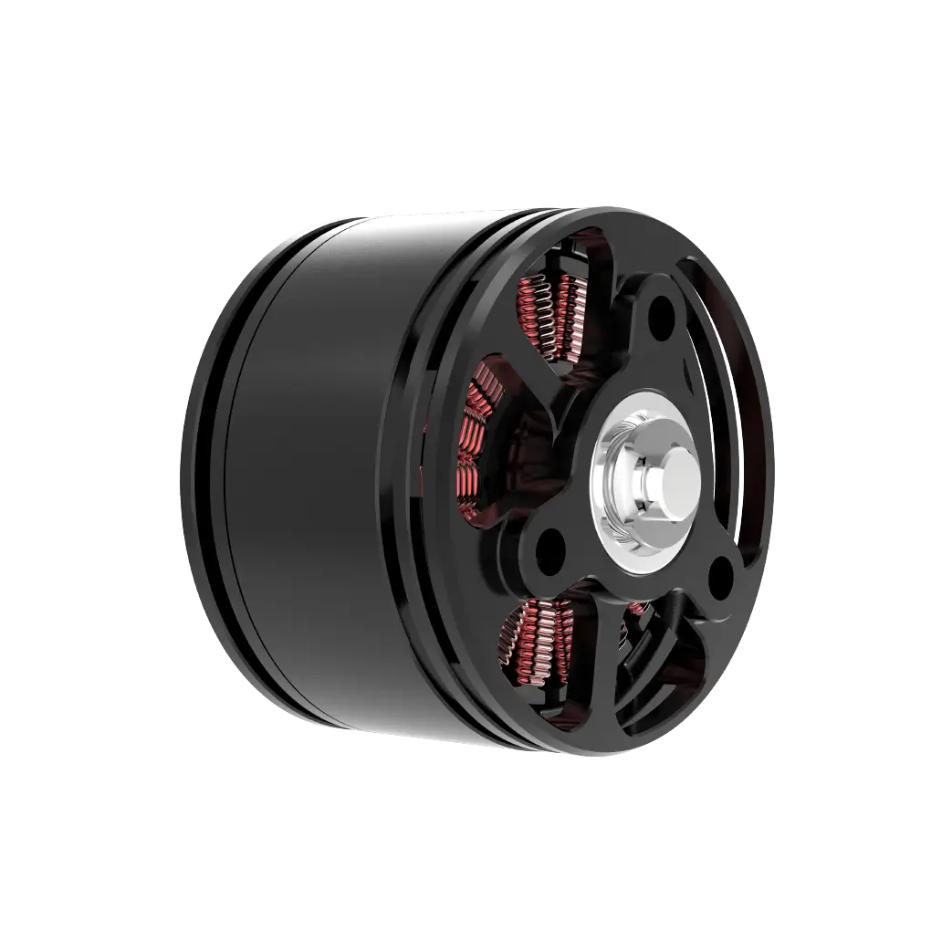
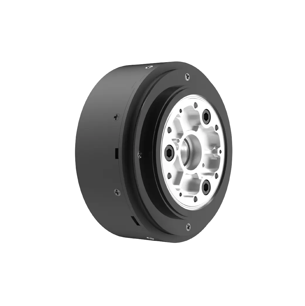
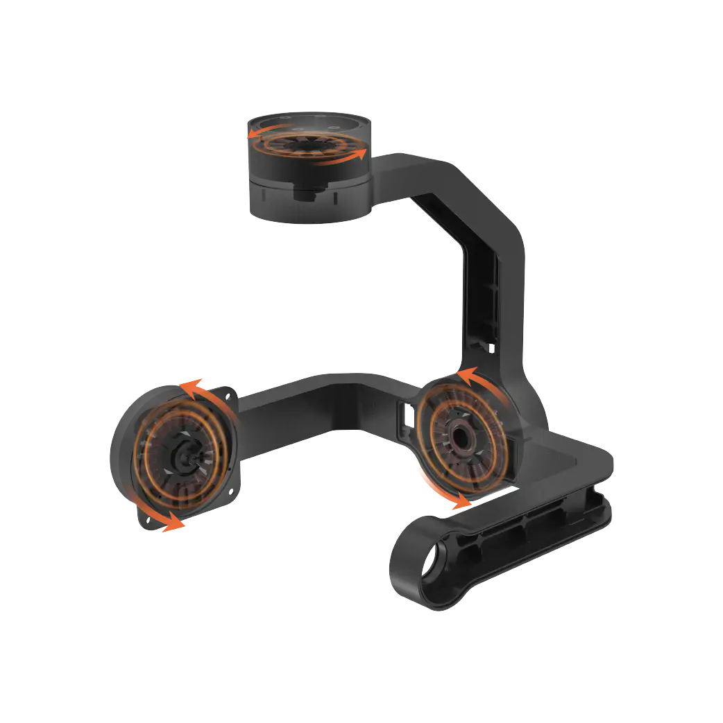
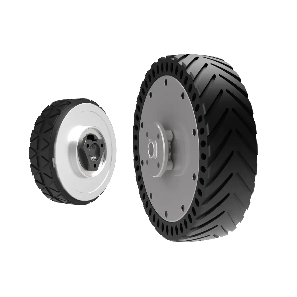
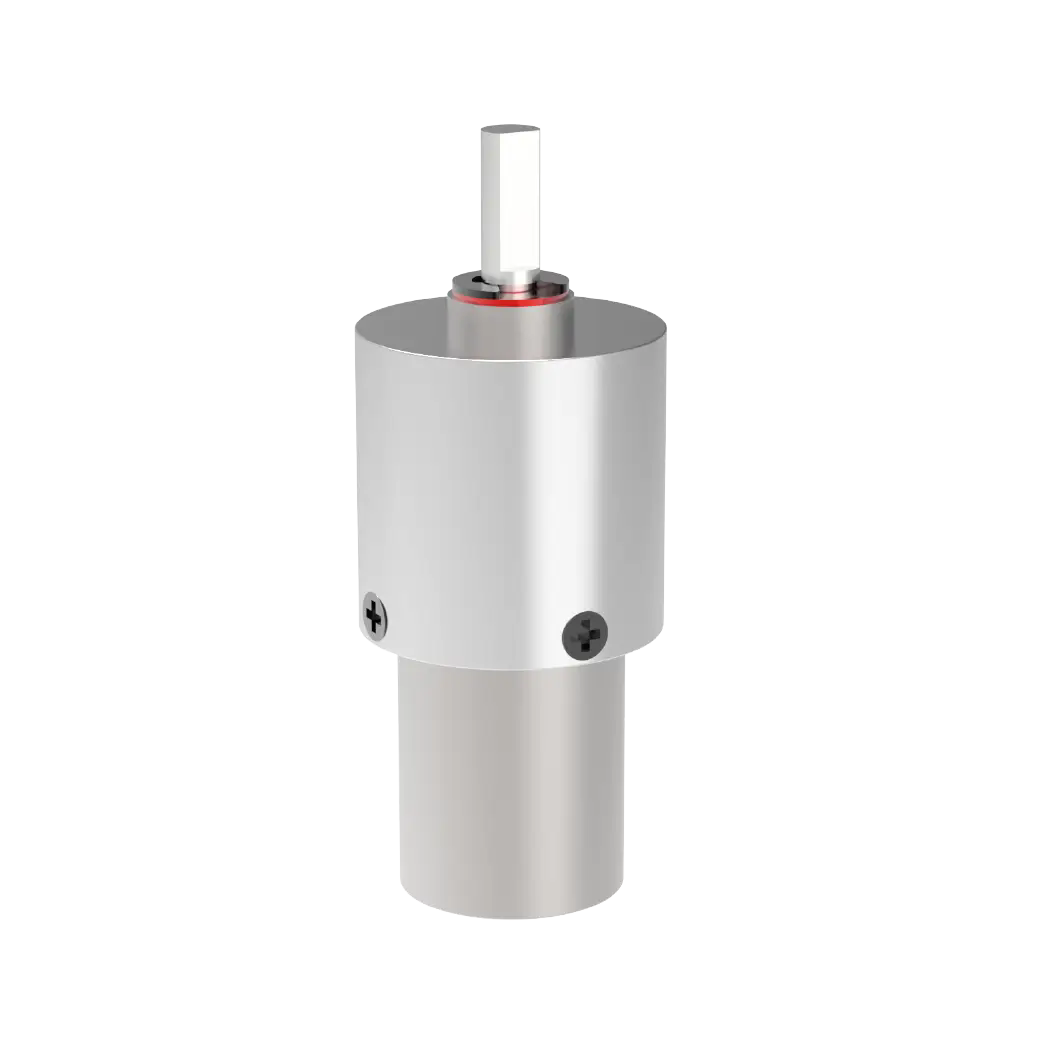
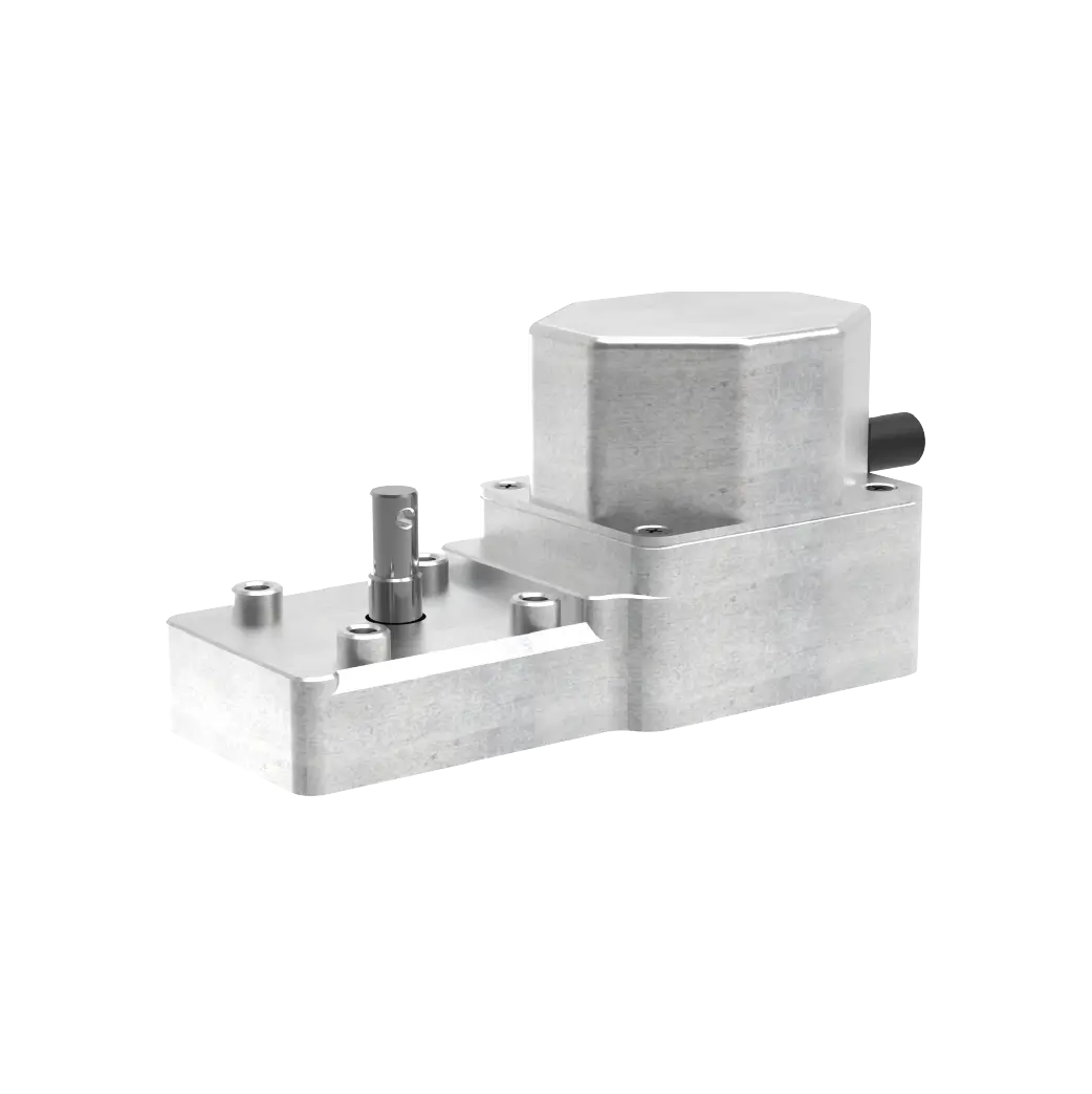
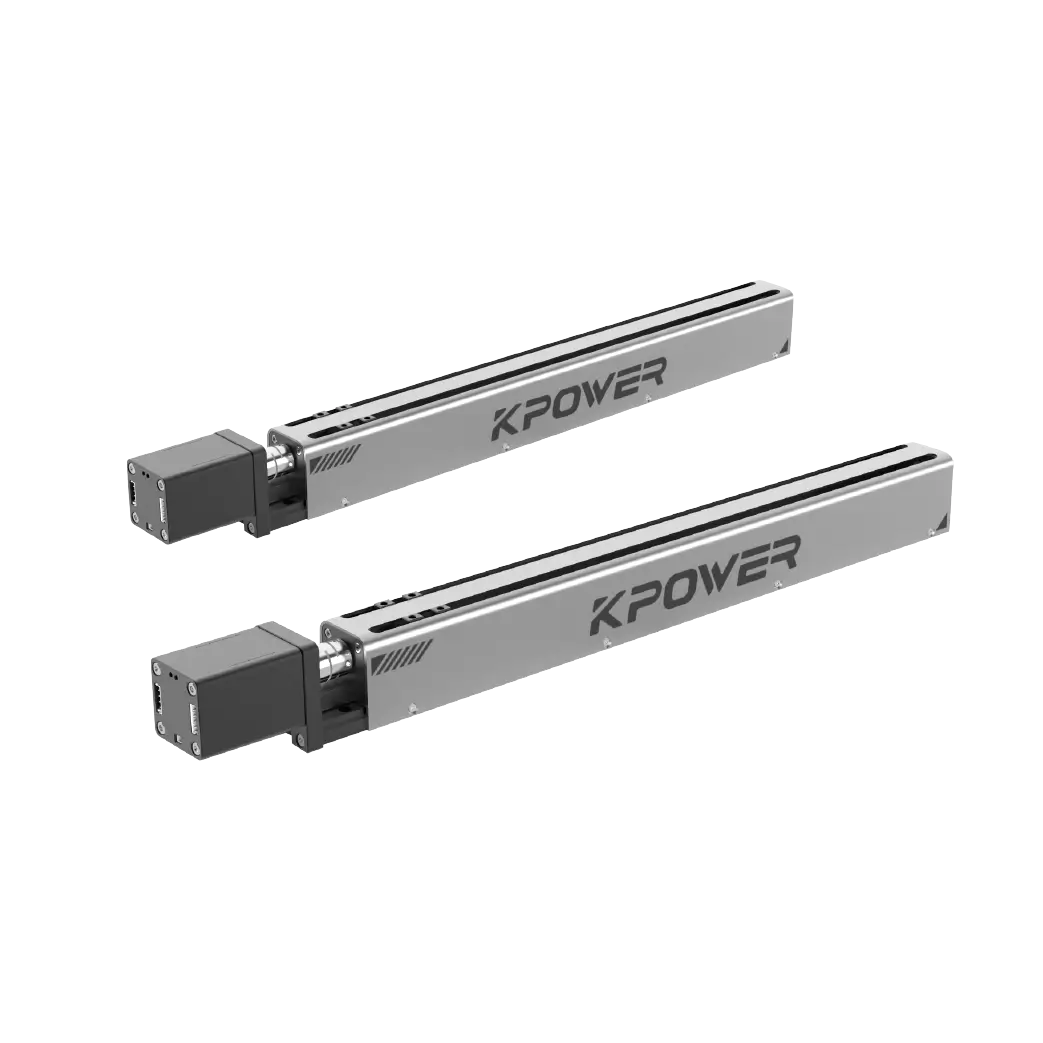
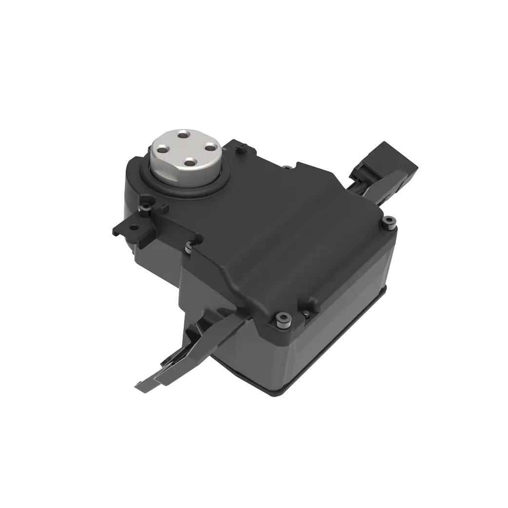
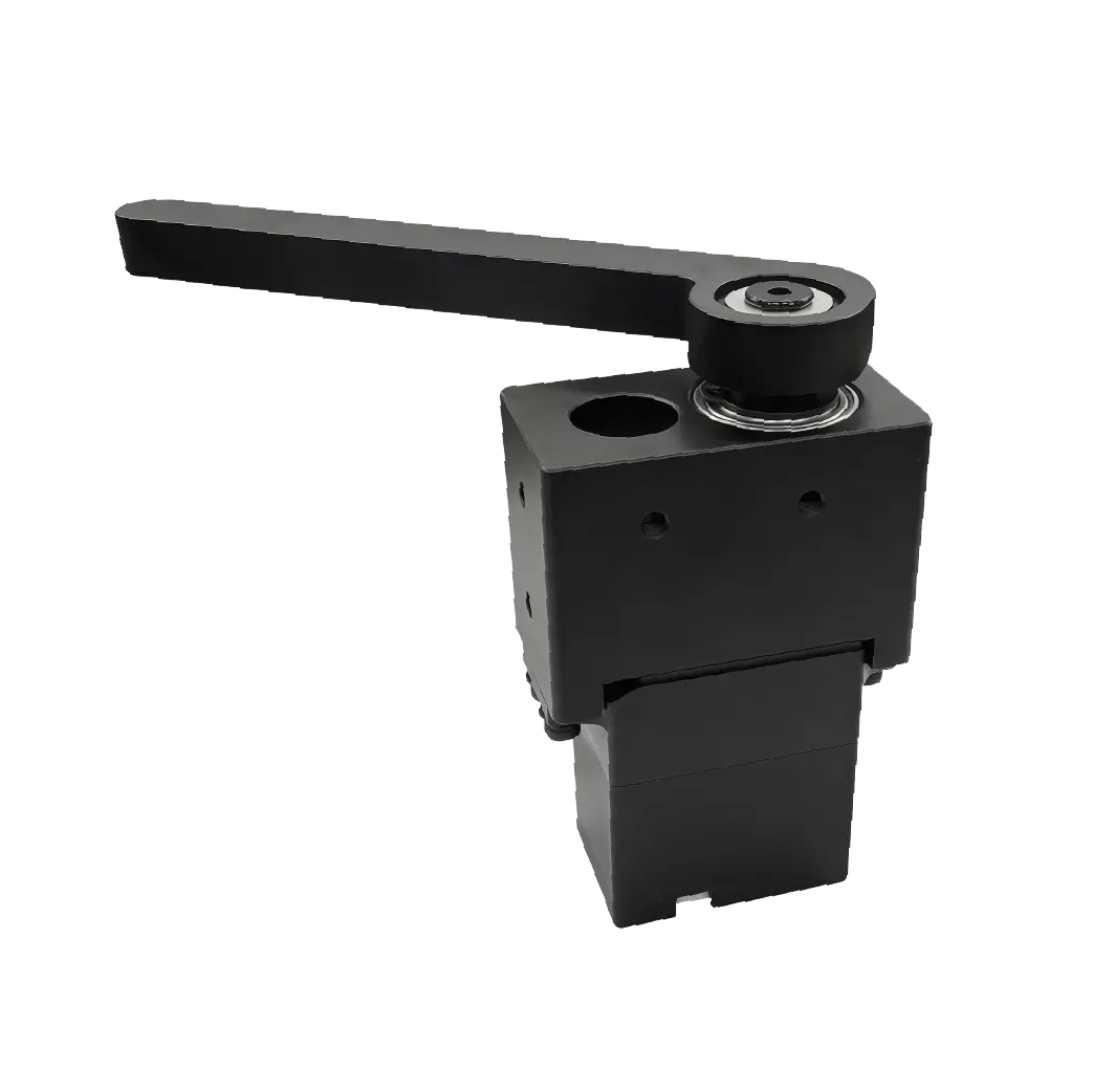
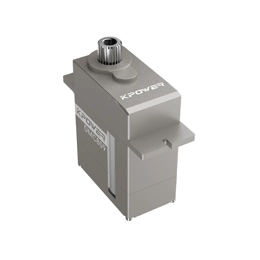
Established in 2005,kpowerhas been dedicated to a professional compact motion unit manufacturer, headquartered in Dongguan, Guangdong Province, China. Leveraging innovations in modular drive technology,kpowerintegrates high-performance motors, precision reducers, and multi-protocol control systems to provide efficient and customized smart drive system solutions. Kpower has delivered professional drive system solutions to over 500 enterprise clients globally with products covering various fields such as Smart Home Systems, Automatic Electronics, Robotics, Precision Agriculture, Drones, and Industrial Automation.
Update Time:2026-01-19
Contact Kpower's product specialist to recommend suitable motor or gearbox for your product.